


Search News
Global Industrial Intelligence Hub (GIIH)Industry Portal
Global Industrial Intelligence Hub (GIIH)Status
Standard Access
Upgrade to PremiumNewsProject Planning Dashboard Setup: KPIs, Milestones, and Resource Views That Matter
Time
Click Count
Why a Project Planning Dashboard Matters in Fast-Moving Industrial Work
A strong project planning dashboard turns scattered updates into decisions that can be acted on quickly.
That matters even more in industrial programs, where schedules depend on suppliers, compliance checks, engineering changes, and regional execution differences.
In practice, the best project planning dashboard is not the one with the most charts.
It is the one that shows whether delivery risk is rising, where resources are tightening, and which milestone deserves attention now.
This is especially relevant for organizations working across medical technology, smart living systems, logistics, mobility, and environmental projects.
Those sectors move at different speeds, but they share one problem: fragmented information often hides the real execution picture.
That is why a project planning dashboard should do more than summarize status.
It should connect KPI signals, milestone progress, and resource views in a way that supports real operational judgment.
For a knowledge platform shaped by global industrial intelligence, this approach fits naturally.
The same discipline used to turn market noise into strategic insight should also shape how execution data is organized internally.
Different Project Contexts Change What the Dashboard Should Show
A project planning dashboard should never be copied from one program to another without adjustment.
The reason is simple: different project contexts create different failure points.
In a regulated medical initiative, milestone confidence may matter more than task volume.
In cross-border logistics work, capacity volatility and handoff timing often deserve more visibility than engineering completion percentage.
An IoT rollout for smart living systems usually needs a clearer view of integration readiness across hardware, firmware, and user testing.
Automotive parts programs often depend on tooling, qualification timing, and supplier responsiveness.
Sustainability projects may be driven by site constraints, permit timing, and measurable outcome baselines.
A useful project planning dashboard starts by identifying which operational constraint is most likely to break delivery.
Once that is clear, KPI selection becomes more disciplined and far less decorative.
Where Milestone Tracking Takes Priority Over Activity Volume
Some programs generate many tasks, but only a few milestones actually control the outcome.
A project planning dashboard should surface those control points first.
For clinical technology, certification, pilot approval, or design freeze dates often matter more than raw task completion.
When these milestones slip, downstream recovery is usually expensive and slow.
In that setting, milestone health should include planned date, latest forecast, dependency status, and blocker ownership.
A simple red-amber-green view is not enough if the dashboard cannot show why confidence is dropping.
A better project planning dashboard also flags milestone volatility.
If forecast dates keep moving by small amounts, that often signals weak assumptions rather than healthy adjustment.
In real operations, repeated minor slips are often more dangerous than one visible delay.
When Resource Views Matter More Than a Perfect Timeline
Other programs fail because the timeline looks reasonable while the resource model is already overloaded.
This is common in engineering, analyst, and cross-functional research environments.
A project planning dashboard should reveal capacity by skill, not just by headcount.
Five available contributors do not solve a bottleneck if only one can handle validation, customs analysis, or tooling review.
In GIIH-style global intelligence operations, this is a practical issue.
Sector experts, regional researchers, and technical editors are not interchangeable resources, even when utilization looks balanced at a high level.
The resource section of a project planning dashboard should therefore show allocation, critical skill coverage, and upcoming demand spikes.
That view is often more valuable than another schedule widget.
- Track committed versus available hours by role or specialty.
- Separate strategic work from urgent interruption work.
- Highlight single-point dependency on one expert or supplier contact.
- Show future overload at least two reporting cycles ahead.
High-Frequency Delivery Environments Need KPI Discipline
In logistics and supply chain programs, speed creates a different dashboard problem.
Too many indicators can bury the few that actually predict disruption.
A project planning dashboard in this setting should focus on lead-time variance, exception aging, handoff delay, and recovery rate.
These KPIs say more about execution health than total shipment count or completed action volume.
The same logic applies to cross-border data projects and industrial market intelligence work.
If updates move across regions and expert teams, the project planning dashboard should expose queue buildup and unresolved dependencies early.
This is where KPI design should stay tied to decisions.
If a number does not change escalation, prioritization, or staffing, it probably does not deserve prime placement.
Different Scenarios Need Different Dashboard Emphasis
A single project planning dashboard framework can still work across industries.
The key is changing emphasis rather than rebuilding everything from zero.
This kind of comparison keeps the project planning dashboard aligned with actual delivery mechanics.
What Gets Misread Before Dashboard Design Is Finished
Several dashboard mistakes appear across sectors because teams assume similar projects need identical visibility.
That assumption usually breaks once the first exception appears.
One common error is showing only current status.
A project planning dashboard should also show trajectory, because stable-looking numbers can still hide rising risk.
Another mistake is mixing executive indicators with delivery diagnostics on the same level.
That creates clutter and slows decisions during reviews.
It is also common to overlook data definitions.
If one region treats a milestone as approved and another treats it as submitted, the dashboard becomes visually clean but operationally unreliable.
A project planning dashboard is only useful when terminology, update timing, and escalation rules are standardized enough to support comparison.
A Practical Way to Build the Right Project Planning Dashboard
A reliable setup usually starts with a small set of decisions, not a large set of metrics.
- Define the two or three outcomes the dashboard must protect.
- Map the milestones that can delay those outcomes.
- Identify which resources are scarce, specialized, or hard to replace.
- Choose KPIs that trigger action, not just reporting.
- Test the dashboard against one recent project failure or near miss.
In actual use, a project planning dashboard should also evolve with project maturity.
Early stages often need dependency visibility and scope stability.
Mid-stage execution usually needs milestone confidence and resource balance.
Late-stage delivery tends to need issue closure discipline and readiness confirmation.
That shift is worth planning for from the start.
From Information Volume to Execution Clarity
A project planning dashboard works best when it reflects how work actually breaks, not how teams wish it would run.
Across industrial intelligence, product development, logistics, and sustainability work, the same pattern holds.
Clear KPIs, credible milestones, and realistic resource views create faster judgment and better course correction.
That is the practical value of a project planning dashboard: it reduces noise and sharpens execution choices.
The next useful step is to review one live program, identify its dominant constraint, and rebuild the dashboard around that reality.
Then compare milestone rules, KPI definitions, and resource assumptions across regions or functions before scaling the design further.
Recommended News
 Sep 24, 2026When does supply chain management software pay for itself?Supply chain management software pays for itself by reducing avoidable inventory, freight, stockout, and planning costs. Learn how to build a credible ROI case.
 Sep 20, 2026How supplier compliance monitoring reduces disruption riskSupplier compliance monitoring helps teams spot risks early, prevent costly disruptions, strengthen supplier resilience, and protect operational continuity.
 Sep 16, 2026What makes a procurement research platform reliable for supplier sourcing?A procurement research platform for sourcing helps teams identify credible suppliers, assess risk, verify evidence, and build defensible shortlists for smarter decisions.
 Sep 07, 2026How to compare cross border logistics services for reliable deliveryCompare cross border logistics services with confidence. Learn how to assess customs, tracking, costs, final-mile coverage, and exception handling for reliable delivery.
 Sep 05, 2026How to Compare an Order Fulfillment Pricing Model by Total CostOrder fulfillment pricing model guide: compare total costs across storage, shipping, returns, fees, and service levels to select the right fulfillment partner.
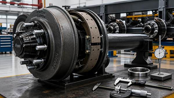
 Sep 07, 2026Sourcing Semi-Trailer Spare Parts Without Compromising Brake Drum QualitySemi trailer spare parts sourcing guide: choose reliable brake drums with verified fitment, traceability, and quality control to protect safety, uptime, and costs.
 Aug 28, 2026France Lowers Foreign Investment Review Threshold to 10% for Non-EU BuyersFrance lowers its foreign investment review threshold to 10% for non-EU buyers, reshaping strategic deals, compliance planning, and cross-border investment.
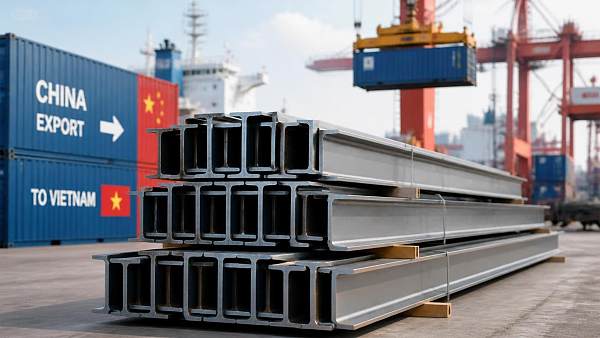
 Aug 25, 2026Vietnam Cuts Anti-Dumping Duty on Chinese H-Beam Steel to 6.78%Vietnam cuts anti-dumping duty on Chinese H-beam steel to 6.78%, reshaping import costs and sourcing decisions in Southeast Asia. See what buyers and traders should do next.
 Aug 21, 2026France Lowers Foreign Investment Review Threshold to 10% for Non-EU BuyersFrance lowers its foreign investment review threshold to 10% for non-EU buyers, reshaping deals in strategic sectors. See what this means for investors, timelines, and cross-border transaction risk.
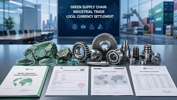
 Aug 20, 2026BRICS Reaches Consensus on Green Minerals Supply Chains and Wider Local-Currency TradeBRICS green minerals supply chains and wider local-currency trade could reshape industrial exports, settlement, and compliance. See what Chinese exporters should watch next.
 Aug 19, 2026RCEP Steel Conference in Nanning Highlights Green Low-Carbon Technology CooperationRCEP Steel Conference in Nanning highlights green low-carbon technology cooperation, tariff rules, and compliance trends shaping steel exports, supply chains, and new regional business opportunities.
 Aug 18, 2026Second Strait of Hormuz Closure Raises Supply Chain Risks as Oil and Freight Costs ClimbSecond Strait of Hormuz closure raises supply chain risks as oil and freight costs climb. Explore impacts on shipping, pricing, and key export sectors now.
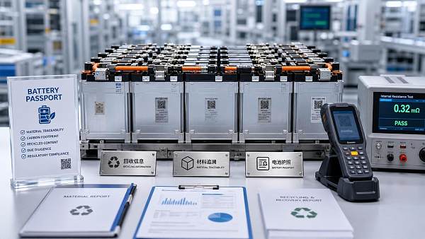
 Aug 16, 2026EU Battery Passport Becomes Mandatory for Exported Storage Products on August 18EU Battery Passport becomes mandatory on August 18, 2026 for exported storage products above 2kWh. Learn what Chinese exporters, integrators, and OEMs must do to stay compliant.
 Aug 15, 2026China Widens Cross-Border Cash Pool Access for Multinationals on Sept. 14China widens cross-border cash pooling for multinationals on Sept. 14, boosting treasury efficiency, liquidity, and payment coordination for China-linked businesses.
 Aug 13, 2026EU Ends Low-Value Parcel Duty ExemptionEU ends the low-value parcel duty exemption, reshaping China-to-EU e-commerce costs, customs compliance, and delivery models for exporters and logistics teams.
 Aug 12, 2026Jiangsu Tightens Overseas Patent Rules for ExportersJiangsu Tightens Overseas Patent Rules for Exporters: learn how new patent search, design-around, and local filing demands may reshape market access in the US, Europe, and Southeast Asia.
 Aug 11, 2026EU CBAM Expansion Adds Hydrogen Products, Pre-Filing Starts Oct 2026EU CBAM expansion adds hydrogen products and starts pre-filing in Oct 2026. Learn how Chinese exporters can prepare carbon data, electricity records, and compliance workflows now.
 Jul 15, 2026Global Shipping Logistics Customs Clearance: Common Delays and How to Prevent ThemGlobal shipping logistics customs clearance made simple: learn the most common delay triggers, reduce document and HS code errors, and keep cross-border shipments moving faster.
 Jul 13, 2026Cloud Project Specification Planning: How to Prevent Scope Gaps Before Procurement StartsCloud project specification planning helps teams define scope, compliance, integrations, and cost drivers before procurement begins—reducing risk, avoiding change requests, and improving vendor fit.
 Jul 12, 2026Logistics Management Analytics: Which KPIs Improve Delivery and Inventory Control?Logistics management analytics helps identify the KPIs that truly improve delivery speed, inventory accuracy, and service reliability across complex supply chains.
 Jul 11, 2026Ecommerce Logistics Sourcing Guide: How to Compare Lead Time, MOQ, and Shipping CostsEcommerce logistics sourcing guide for buyers comparing lead time, MOQ, and shipping costs. Learn how to reduce landed cost risk, improve supplier selection, and make smarter sourcing decisions.
 Jul 10, 2026Supply Chain Bottleneck Analysis for Exporters: Where Delays Happen and How to RespondSupply chain bottleneck analysis for exporters reveals where delays start—from suppliers and documentation to ports and delivery—and shows practical ways to respond faster, cut risk, and protect margins.
 Jul 09, 2026Supply Chain Intelligence Europe: Which Data Signals Matter for Sourcing Decisions?Supply chain intelligence Europe: discover the key data signals shaping smarter sourcing decisions, from supplier risk and lead times to compliance, costs, and logistics performance.
![]() Jul 07, 2026Supply Chain Intelligence and ISO Standards: How to Align Data, Traceability, and ComplianceSupply chain intelligence ISO standards explained: learn how to align data, traceability, and compliance to reduce risk, speed audits, and build resilient operations.
Jul 07, 2026Supply Chain Intelligence and ISO Standards: How to Align Data, Traceability, and ComplianceSupply chain intelligence ISO standards explained: learn how to align data, traceability, and compliance to reduce risk, speed audits, and build resilient operations.